Table talkers are effective, affordable print marketing used across UK restaurants, cafés, pubs, retail counters, and events. They capture attention and encourage quick decisions, yet poorly designed pieces are often ignored, wasting budget and weakening brand impact. Learn how to avoid the most common mistakes and create clear, persuasive displays that work hard on every table. For expert printed table talker guidance, start by aligning design choices with message, audience, and placement.
1. Print Setup Errors: Resolution, Bleed, and Colour Mode
- Low resolution: Images under 300 dpi appear pixelated.
- No bleed: Without at least 3 mm bleed, edges risk being cut off.
- Wrong colour mode: Designing in RGB instead of CMYK results in inaccurate colours.
Fix: Create artwork in CMYK at 300 dpi and follow your printer’s bleed guidelines for sharp, consistent results.

2. Overloading the Design with Too Much Information
A cluttered table talker overwhelms readers. Trying to include menus, multiple offers, or long descriptions dilutes the message and reduces impact.
- Limit each panel to a single focus and outcome.
- Use a clear hierarchy: headline, supporting detail, then a call to action.
- Keep copy concise and scannable at a glance.
Fix: Prioritise one message per panel and trim non-essential text.
3. Weak Branding Consistency
Inconsistent fonts, colours, or logos make table talkers look disconnected from the rest of your marketing and reduce recognition and trust.
- Use brand fonts and approved colour values.
- Keep logo placement consistent across panels.
- Match tone of voice with menus, signage, and social content.
Fix: Follow brand guidelines rigorously and apply them to every panel.
4. Using the Wrong Layout or Shape
The format affects performance. A triangular style can support multi-angle visibility in restaurants, while a tall slim design might suit tight retail counters.
- Match the shape and size to table space and sightlines.
- Design all visible panels with intention.
- Balance height with stability and readability.
Fix: Select a format that maximises visibility from typical viewing angles in your venue.
5. Poor Readability: Fonts, Colours, and Contrast
Stylish on screen does not always mean readable in real life. Small type and weak contrast undermine legibility.
- Use a minimum of 10–12pt for body text.
- Ensure strong colour contrast between text and background.
- Reserve decorative typefaces for short headings.
Helpful resource: For accessibility principles, see UK Government Inclusive Communication guidance.
6. Missing a Clear Call to Action
Without explicit direction, customers may not act. A visible prompt turns attention into outcomes.
- Order at the bar, placed near pricing or specials.
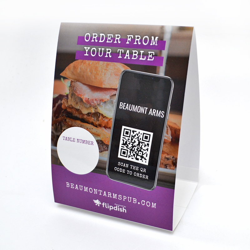
- Scan the QR code for today’s menu, positioned next to the code.
- Ask staff for details, paired with a time-limited offer.
Fix: Make the next step obvious and easy to follow.

Quick Reference: Table Talker Design Dos and Don’ts
| Do | Don’t |
|---|---|
| Use CMYK colour mode for print | Design in RGB |
| Set up 3 mm bleed on all edges | Forget bleed and risk trimming errors |
| Keep text short and focused | Overload with long copy |
| Stick to brand colours and fonts | Mix unrelated styles |
| Use readable font sizes (10–12pt minimum) | Use tiny or highly decorative body text |
| Include a clear, visible action | Leave readers without direction |
| Proofread thoroughly and request proofs | Rush to print without checks |
7. Skipping Proper Proofing
Typos, incorrect prices, and misplaced logos undermine credibility and can trigger costly reprints.
- Proofread with at least two reviewers.
- Approve a digital proof before production.
- Review a printed sample when timelines allow.
Fix: Treat proofing as a non-negotiable stage of the workflow.
8. Common File and Workflow Errors
- Exporting JPEGs instead of print-ready PDFs.
- Using unlicensed fonts or missing font files.
- Forgetting to embed or link placed images.
Fix: Use professional design software, package artwork, and verify exports before sending to print.
9. Lessons from Real-World Campaigns
- A café simplified five overlapping promotions to a single “2-for-1 Drinks” headline and saw increased engagement.
- A retailer reprinted an RGB job in CMYK, resolving dull colours and strengthening on-counter visibility.
Small improvements to clarity and print setup often deliver outsized results.
Conclusion
Table talkers work best when the design is clear, concise, and technically sound. By avoiding common mistakes across print setup, content hierarchy, branding, readability, and calls to action, your displays can attract attention and prompt immediate responses.
Next step: Review your current artwork against the quick reference table and refine before sending to print. Thoughtful choices at this stage help your table talkers perform consistently in real-world settings.
